It’s time to rise again
On the eve of our 140th anniversary year, Hull KR are proudly unveiling the evolution of our identity that will represent the club for the 2022 season and beyond.

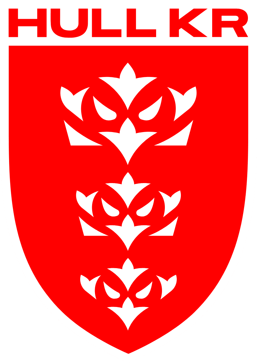
Our new badge
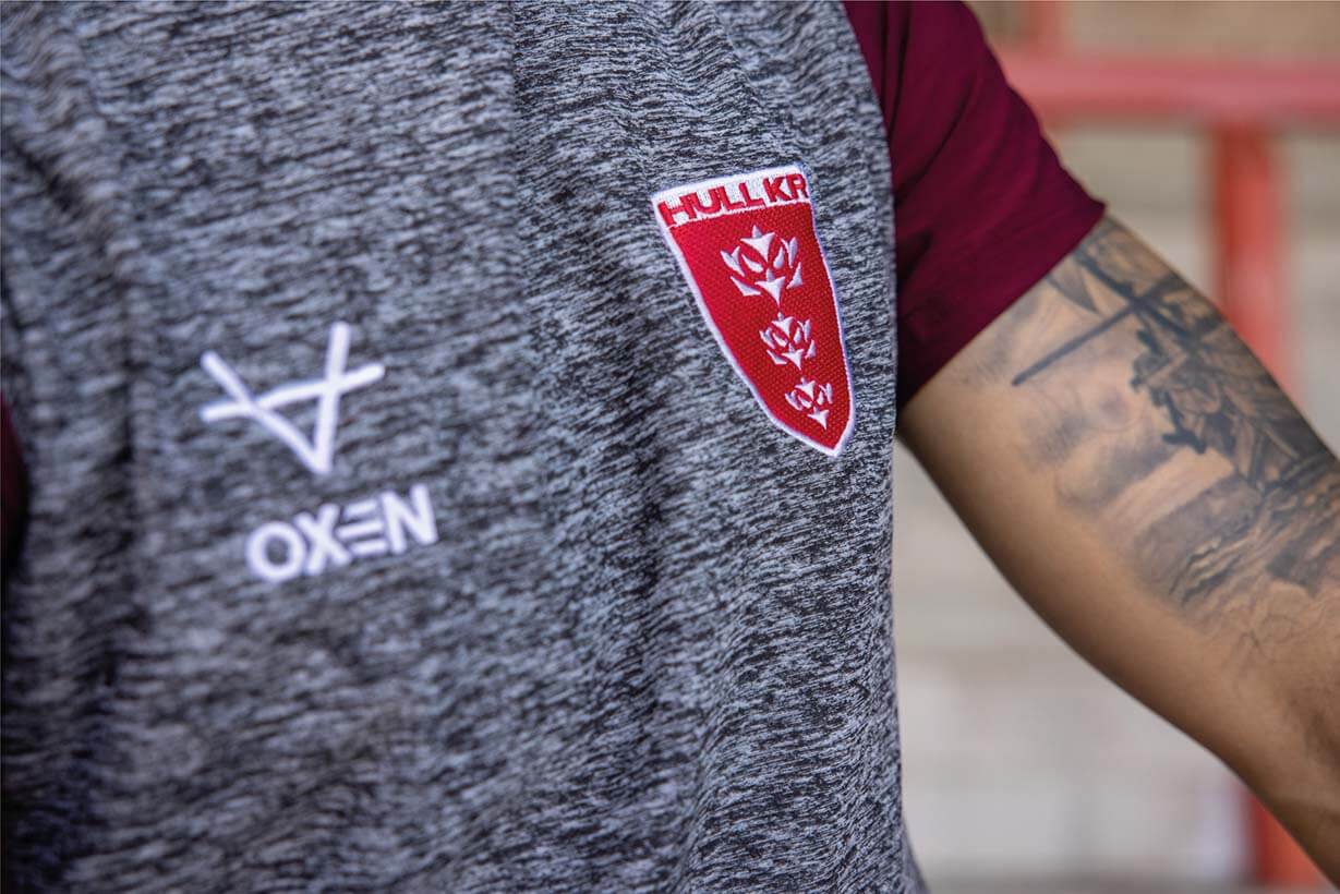
Evolving from everything our fans know and love about one of the world’s most iconic Rugby League names, our new look is inspired by our Robins nickname, which originates from when we were known as the ‘Robin Redbreasts’, a term first coined in the 1880s.
The badge retains all its core elements, including the three crowns representing the City of Kingston upon Hull and its traditional shield shape, whilst unlocking the potential of using the fierce and territorial Robin across our digital platforms and retail.
The
Why
On the eve of the club’s 140th Anniversary, one of its most famous names is looking to evolve as we look to build the foundations for the next generation.
In the digital age, and fans across all sports changing how they consume content, competition for fans’ attention and interest has never been greater.
The current badge heavily inspired by the Kingston Upon Hull badge, that remains part of the Club’s identity whilst evolving to a format maximising our exposure on digital platforms and broadcast media, providing commercial opportunities to secure this sport’s future
We must respect our history whilst inspiring a new generation of supporters to carry our rich tradition forward, to find new fans away from the sport. Everyone at club now focused on moving forward and building for our next 140 years of history, change is needed and a world class identity is the reason underpinning this period of transformation.
The
How
The process, which has taken two years from start to finish, has seen supporters aged 4 to 75 get involved alongside key partners, former players, and club historians.
During the initial research phase fans were keen to ensure this was a natural evolution rather than an overhaul. Supporters were proud that the club are one of the few in Rugby League that remained true to it’s original identity with no name change or Americanised badge introduced in the Super League era like many other teams. Yet they recognised that the club needs to evolve and move forward in the digital world.
14 initial concepts were presented with none hitting all the key parts of the brief that we had evolved enough. Fans showed a desire to push the club further and to future proof the change.
Further research was undertaken, it was identified that the ‘Robin Redbreast’ nickname is something authentic to the club’s history that has resonated for generations of supporters and therefore could be explored as an angle.
In all 106 variations of the new look were explored, with the final version receiving overwhelming approval from the fan sounding board.
One key part of insight from players and former players is that you can tell by looking in the opposition players eyes if they are up for the battle on the field. So any eyes in any Robin should look as fierce and as aggressive as possible.
Why are we evolving?
Sometimes history can inspire you, but to truly move forward, sometimes you have to look forward and evolve. As the club looks to celebrate its 140th anniversary, we have to use this as a time to celebrate everything we know and love about the club, but to also reflect and ensure we are moving forwards at every level to ensure we are here for the next 140 years.
The crest which we know and love today, was designed for an analogue world, to attract and retain the next generation of supporters we have to evolve consider how we compete with the challenges of the 21st century and the digital world.
Whilst retaining a full traditional version of the badge, we also now have a fierce looking Robin which will be used as an icon across digital platforms and selected retail lines. ‘The Robins’ is in our DNA and are fiercely territorial animals who sing to proclaim territory. We were one of the first clubs in sport to ever adopt an animal based nickname. Whilst we remain true to who we are, and we’ve never changed our name, it’s time to leverage that history and apply it in the modern world.
This is about the club building on 140 years of history to continually move forwards, with a fresh approach in how we look and how we think whilst staying true to who we are.
We all have a role to play in moving the club forward to inspire the next generation of supporters, partners and players to understand our history and heritage, but not be afraid to evolve and grow. This is the start of an exciting new chapter for the club, and our greatest legacy will be that we are a community centric club in the heart of East Hull, that’s still evolving, growing and pushing itself forward for the next 140 years.
The Robins…
The Robins nickname can be traced back to the late 1880s…
Rovers original nickname, bestowed on them in their very early seasons because of the red band across the chest of their jerseys, was ‘the Redbreasts’.
But by the end of the decade, probably due to the association of the words Robin and redbreast, notably in the 18th century nursery rhyme ‘Little Robin Redbreast’, the word Robin was added and the club became commonly known as ‘the Robin Redbreasts’, particularly in the local press. Until early in the 20th century, the nicknames ‘Robins’, ‘Redbreasts’ and ‘Robin Redbreasts’ were all in use as nicknames for the club.
However, the redbreast nicknames gradually started to fall out of use, and by the start of the first World War, the club was known simply as ‘the Robins’. Since then, the Robin has featured on the front of the club programme, in Rovers-related cartoons and badges, and for years the Rovers column in the Rugby Leaguer was entitled ‘In the Robins’ nest’.
In more recent years, the popular club mascot, ‘Rufus the Robin’, a nod to the rufous-backed robin, has revived the link with the club’s now traditional nickname.
To many, the Robin is a pretty, fluffy little bird that adorns Christmas cards – but the truth is rather different. According to the Natural History Museum, “The Robin might seem cute, but it is actually a highly territorial bird and will aggressively defend its domain against others,” adding that “these much-loved birds are on the rise as the UK robin population continues to increase.”

Did you know?
Robins sing to proclaim territory!
Much like our loud and passionate fans on match day. Stand tall, your chest out and let everyone know who are and what we represent.

Seeing a Robin is a symbol a loved one is still with you.
Once a Robin, always a Robin!

Robins are fiercely territorial.
Just like the players who represent us on the pitch, Robins are small in size but big in heart. They never take a backward step and look their opponent directly in the eye before defending their home.

The Designer
The new Hull KR badge has been created by renowned design studio Nomad, whose work for the Premier League re-brand was critically acclaimed and loved by sports fans around the world.
The project has been led by Stuart Watson, a partner at Nomad, and fan of the sport from the North West of England, and lifelong Hull KR fan Craig Franklin, who is Head of Marketing for the club.
As big sports fans, both know what club badges mean to the people who wear it on the terraces, including their own families and friends, and were tasked with the difficult challenge of crafting our new image.
Shop
Timeline of Events
Over two years of development, with input and support from fans, staff, club partners and local design experts the club explored 14 different routes, resulting in 106 variations and finally 14 variations of the final concept, no stone was left unturned, or feedback not implemented, to find the winning combination.
Here’s the timeline of events…
-
Super League meet and discuss feedback from Sky Sports and independent experts about the look and feel of the sport, with rationale behind how the existing portfolio of badges are not fit for the modern world.
-
Internal dialogue at the club begin around if and when should the crest be reviewed. Decision is made not to rush the process but explore options.
-
Research compiled on crest history, historical versions of the crest and the origins of “The Robins”
-
Brief submitted to Nomad and exploratory work undertaken.
-
Nomad present 14 potential different routes or angles to the club.
-
Work on the project suspended whilst the pandemic affects every part of the club.
-
Initial concepts and ideas revisited with preferred routes narrowed down.
-
New Chief Executive Paul Lakin is appointed and gives the project the go-ahead to move forward ahead of the 2022 season.
-
Initial concepts taken to a limited number of supporters and partners to explore the appetite for change, and gauge initial feedback and thoughts on the concepts. Initial feedback is positive but supporters wanted to see a bigger change than what was been proposed.
-
Feedback panel formed containing fans aged from 4 – 75, club historian’s, club partners, staff, former players and ambassadors. New concepts presented (based on the earlier feedback) with a clear favourite route becoming clear.
-
Route refined and tested in multiple formats including retail product, digital work and a further group of supporters who were new to the project, with no prior knowledge of the journey so far.
-
Final artwork agreed.
-
Final 2022 retail ranges signed off with new crest in place.
-
Work begins on the brand launch including how and when it will be unveiled to all supporters.
-
Full stadium audit takes place of every location the crest needs to be updated.
-
First retail product arrive with photography and videos complete ahead of the launch
-
New brand unveiled to the world.

Club Badge History
The badge has always changed and evolved over time, from the original HKR version first seen at Wembley in 1964 to the most commonly used one seen today. “The Robins” and cartoon versions of Robins were more frequently used across club literature, including the match programme, with crests not started appearing regularly on shirts until 1980. With many tweaks to shield shape, detail and colours along the way, the most radically different version seen was centenary crest featuring a Lion and reversing back to the HKR insignia which was reimagined for the 2017 season.
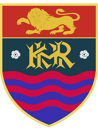
Heritage badge primarily used for key anniversaries of the club.
First used on a shirt for the 1980 Challenge Cup Final, and the subsequently applied to all home and away shirts.
Used in the 1990s and early noughties until the modern shield shape was applied and consistent colour way.
HKR insignia used across the club on merchandise and other stadium assets.
One of the many colour variations of the old style shield used during the 1990s.
First badge to ever appear on a Hull KR shirt, worn for the 1964 Wembley Challenge Cup Final.
Popular version of the Robin used throughout the years across match programmes and supporter groups.
Version of the crest and Robin used in the 1960’s

Testimonials
Roger Pugh, Club Historian
The club have paid respect to its history by retaining the basic shield shape, the three crowns and the colour, and made the welcome decision to include the robin, with which the club has been associated since its very early days. I have heard it said that a robin is tame by comparison with a rhino, a wolf, a giant or a warrior – but not so! The robin is a very feisty bird – predatorial and territorial – and quite vicious! Look around – other clubs have completely changed their crests or logos over recent years, along with other sports outfits and businesses. It is right to consider whether the club’s image is right for the future, and to update it if necessary. Next year, the club celebrates 140 years and in many ways, is preparing to move into an exciting new era. A new crest symbolises this.
Neil Hudgell, Hull KR Owner
The existing badge is all I’ve known and loved since I first became a supporter. However, the time is right to evolve and progress as we look to move forwards on and off the field. I love our history, and the stories we can all share, but it’s time to create some new memories together and I’ll look forward to doing that proudly wearing our modern new look.
Rovers Supporters Group
We were delighted to contribute to the design and development of this evolution. We are confident fans will love the end result which represents the history of the club, yet brings a modern and fresh perspective.
